

Case Study
Media Platform Redesign
Product Overview
Entwine EMP (enterprise media platform) facilitates the capture, management, and playback of media files from meetings, lectures, and other live events. Built on an open source application called Opencast, functionality includes scheduled and ad hoc media capture, device and user management, media processing, editing and playback.
Role
UX Designer (2018-2019)
User Research, Information Architecture, Interaction, Prototyping, Visual Design & User Testing
A little more context…
When I joined the Entwine product team, the application was already being used heavily in-house
We were able to leverage feedback from internal users
The Product Team was getting ready for a pilot release
The application was still basically just Opencast with a few tweaks
Our 2 person UX team was tasked with redesigning Entwine’s key workflows to be user-centered
We were also tasked with gradually implementing a new design system
⚠️ Update
Unfortunately, this product was discontinued in 2019 💔. It was a blast to learn/work in the field of Education Technology, and I hope to work in that space again some day.
First Things Last 🤔
Entwine was fairly mature when I joined the team. Their process was agile and efficient. However, it was clear that the feature dense UI was designed to provide everything for every user. This approach generated functionality that many users did not want/need or even understand.
In order to become more familiar with the technical product and its key workflows, our team carried out a thorough heuristic analysis. From there, we conducted a baseline usability test. Read all the juicy details below 🍉!
Heuristic Analysis
Referring to Nielsen’s 10 usability heuristics, my colleague and I carefully analyzed the current application. We documented potential usability issues and made recommendations on how to solve each. We combined the findings with user feedback to help us formulate a baseline usability test.
Examples
🏁 Baseline Study
Overview
Baseline testing was conducted to measure the performance of the current application to compare it with future iterations
10 representative users were recruited to evaluate the current application
Each session lasted about an hour
Participants completed 6 representative tasks
We rated the task performance (Success, Success with Difficulty, Success with Help, Partial Success, Fail)
We also measured time on task and number of clicks
Participants were asked to rate ease of use and overall confidence in task completion
Participants were also asked to “think out loud”, and their comments were analyzed as qualitative data
Key Findings
Majority of participants were comfortable using the application
Participants expected workflows to happen at the course level, rather than with individual recordings
Participants were confused by:
Scheduling recordings
Publishing content
Technical jargon 🤖 ☠️
Task 1 analysis
Metrics per task
User-ranked ease of use and confidence level
Conclusions
The current design does not match the users’ expected workflow
Participants expect courses to be the starting point for all workflows, not individual recordings
They do not expect recordings to exist outside of predetermined groups (e.g. classes, courses, departments)
Participants expect to be able to copy courses and reuse them (e.g. roll over from spring term to fall term)
Multiple pages contain confusing and irrelevant information
“I want to go into the actual course, to then add a recording.”
“I was thinking from the course, setup a recording.”
“I don’t see my course, so what am I adding my recording to?”
Recommendations
Based on our findings and conclusions, we made design recommendations for each of the six tasks we asked our participants to complete.
Task 1: Create a Course

We greatly simplified this process. With a condensed workflow, users can pause and save their new course, resuming the process at a convenient time.
Hypotheses
Utilize a single actions menu to contain all functionality on each page – e.g., Add a course, recording etc.
Rename add a recording to add/schedule a recording
Provide a way to add/schedule a recording from add course workflow
Reduce the form fields and show just the necessary form fields to add/schedule a course
Make the select group and select user functionality more discoverable
Task 2: Schedule a Recurring Recording (Not part of a course)

Participants spent the most time and clicks on this task. Research suggests key components of this workflow, and the overall workflow itself did not match participants’ expectations.
Hypotheses
Have the scheduling section come before the recording metadata form
Provide a way to schedule a recording as part of the create course workflow
Provide information regarding how the titles of recurring recordings will be generated by default
Give the user an option to customize naming convention for a set of recordings
Further Exploration
Rethink the presentation of duration field
Task 3: Edit a single recording’s metadata
Participants spent the least amount and clicks on this task. Recommendations from Task 1 apply here as well.
Hypotheses
Provide a way to edit recording metadata of a single recording as part of the course content workflow
Utilize tagging functionality as a way to add noncritical metadata, e.g. adding a guest lecturer
Task 4: Publish a recording
Most participants experienced difficulty completing this task. All participants said they were surprised by the location and labeling of the publish functionality.
Hypotheses
Rename the tab in the recording metadata from General to Publication
Rename the bulk action label to from Start Task to Publish
Specify the selected recordings in the publish form

Task 5: Add a new user and add that user to a group

This task had the second highest rate of success, but Participants has a couple suggestions for how it could improve.
Hypotheses
Provide a way to add the new user to a group directly from the Add User workflow
Arrange the user list in logical order after a user has been added
Further Exploration
Research the need around adding users in bulk
Task 6: Delete multiple recordings
Seven participants succeeded in completing this task giving it the highest rate of success. However, multiple participants mentioned the lack of visual feedback as the action was completed.
Hypotheses
Clearly communicate role based deletion rights
Rename the status after bulk deleting recordings to Deleting
Additionally, show the processing visually as a feedback mechanism

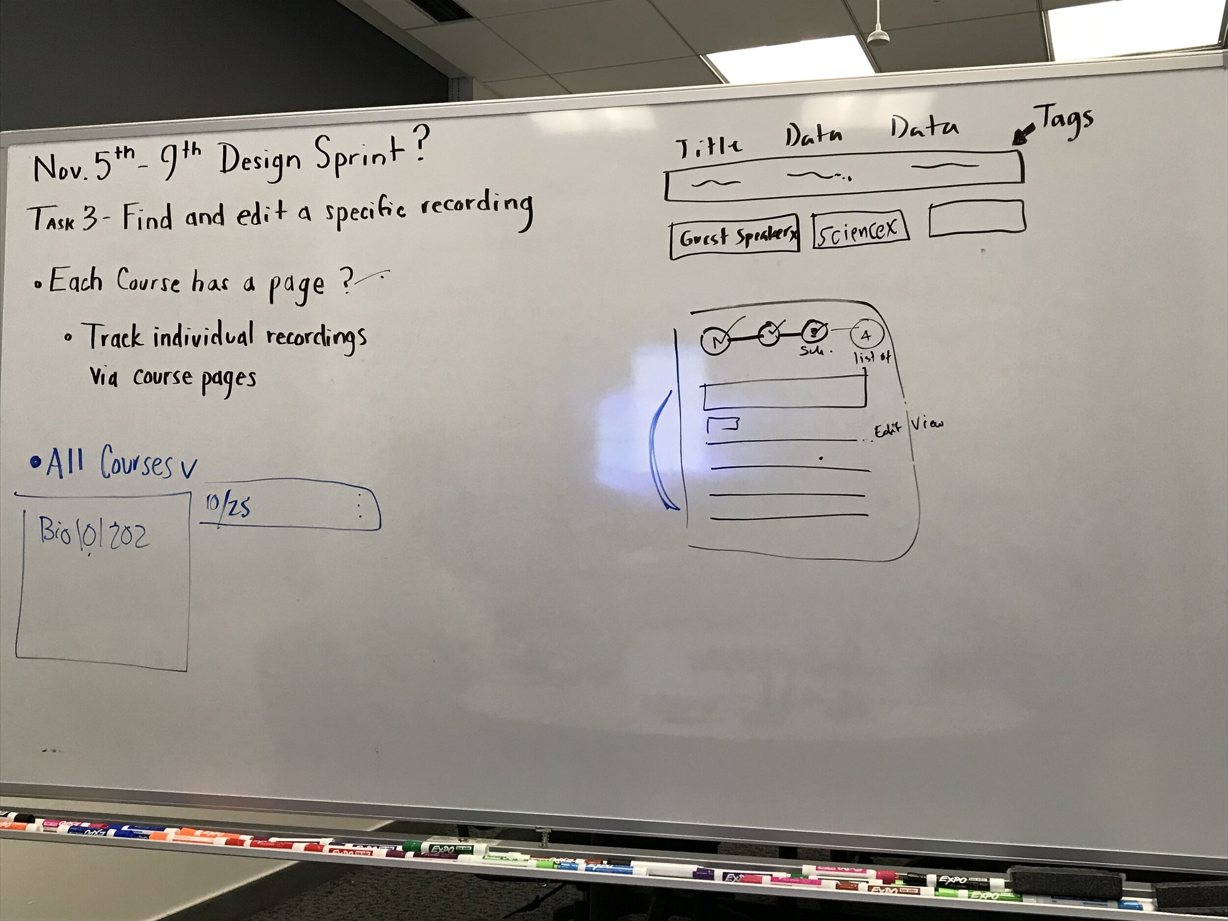
Design Sprint
We scheduled a design sprint right on the heels of our baseline study analysis. We wanted to take our design recommendations further, specifically for the task of scheduling recordings. This is a must-have feature, and the current implementation gave our participants a run for their 💰.
Overview
Details
For five consecutive days, our feature team met to ideate on solutions for improving our scheduling workflow.
Participants
UX, Product Management, Engineering, and Quality Assurance
Key Topics
Topic 1: Add Recordings from within a Course
Questions
Does it make sense to schedule a recording from within the course work flow?
What do users expect this “schedule” to look like
Does it make sense to show all the recordings that belong to a course within the course modal/from the course page?
Should there be a separation of schedule and recordings within a course?
Should we separate recordings by tabs (finished, scheduled, processing)
Does it make sense to include a # of Recordings column in the table on the course page?
Users could link to a course specific page from this column
Users could add content from this column
Should we have a course specific page?
How would a user navigate to a course specific page?
What should we include on a course specific page?
Should all recordings belong to a course (or some other label?)
Topic 2: Quick Add feature
Questions
Does it make sense to have quick actions, not just quick add?
Do users understand that they can universally add content with this feature?
Does it make sense to schedule a recording from the Quick Add?
Topic 3: Tabular view for recording status (scheduled, in progress, finished)
Questions
Do these categories make sense? Are these the only tabs we need?
Should filters on each tab be contextual?
Should we be able to duplicate a scheduled recording?
Should there be a relationship between a sheduled recording and a completed asset?
Where would the user expect to see the status of a recording?
How should we notify the user about status updates?
How much information should we give them in a notification?
Topic 4: Targeted wizards for upload vs schedule recording
Questions
Does it make sense to simplify wizards by putting metadata fields under an advanced menu (tab)?
Should we separate the actions of uploading a recording and scheduling a recording/scheduling a live event?
Each would have a specific wizard
Limited Prototype
We wanted to leave the Design Sprint with something we could test, so we incorporated our ideas into a basic prototype.
Outcome
Sadly, this prototype never saw the light of day. Directly after the Design Sprint wrapped, Extron made a business decision to move Entwine EMP from an on-premise solution to the cloud ⛅️. This decision meant freezing all feature-related work, so that Engineering could focus solely on the transition to cloud services and architecture.
What’s Next?
📊 Usability Testing
🔄 More Iteration
📋 Create User Stories
🔥 Repeat steps 1-3
When this project opens back up, we will need to test the designs generated during our Design Sprint. Based on the results, we can move forward with the recommended functionality or continue to iterate on it until there are no known usability issues.
We will then work with Product Management and Engineering to translate our designs in User Stories, and continue making incremental improvements for our users.