

Case Study
Employer Alert Center
Project Overview
The goal of this project was to centralize (and standardize) time-sensitive notifications for Sales and Service Reps. By bringing these real time alerts to the tool where Reps are spending most of their day, we are giving them the best possible chance to make a connection with an Employer* while they are using Indeed’s products. This custom object in Salesforce handles group assignments, but also allows individual Reps to optionally subscribe to additional alerts.
*Employer is how we refer to people who use Indeed’s hiring tools.
Company
Role
Lead UX Designer (2022-Current)
User Research, Information Architecture, Interaction, Prototyping & User Testing
Introduction
Throughout this project, I worked with an amazing Product Team who fully embraced the Product Trio concept. We completed some Discovery up front, but we relied primarily on continuous discovery to incrementally deliver value to the Sales and Service teams at Indeed.
Here are some of the ways this project was successful:
aaaa
Problem Statement
Our Sales and Service teams don’t know when their clients are actively using Indeed’s products.
Teams are being notified after the fact, and are missing opportunities to connect with clients while they are logged in.
We believe that we can increase the likelihood of upselling or cross selling, if we can improve the way Sales and Service Reps connect with clients who are actively using their accounts.
We believe that we can also improve the Employer experience by providing them with the resources they need to make decisions while they are using our products.*
*The UX team added this last bullet point. Traditionally, our internal Product Teams have not considered the Employer experience because they do not use the internal tools we build. However, we know they are directly affected by our Sales and Service models and should be included in the Service Design.
📜 Additional Context
Indeed originally relied on a homegrown CRM. It was designed for managing a B2C business model. As Indeed grew into the leading job marketplace in the world, the old CRM was not able to support a B2B model, and teams were migrated into Salesforce. However, the new instance of Salesforce had to be designed in a way that it would accommodate the old CRM’s data structure, leaving us with a less than version of the most popular CRM in the world.
The biggest challenges we faced were:
Limits to the hierarchical modeling of national and franchise accounts
A 72 hour delay in surfacing Indeed product data within Salesforce
Empathize
🎯 User Feedback
We needed to better understand the goals how the tools and processes being used todayThe following insights were collected via Sales and Service teams, so that we could baseline the current experience:
Sales Teams
aaa
Service Teams
aaa
Define & Ideate
📝 In order to give Sales and Service teams what they want and need, we needed to . We created this basic set of requirements to help guide our initial ideation:
a
Interaction Model
a
Our Hypothesis 🧐
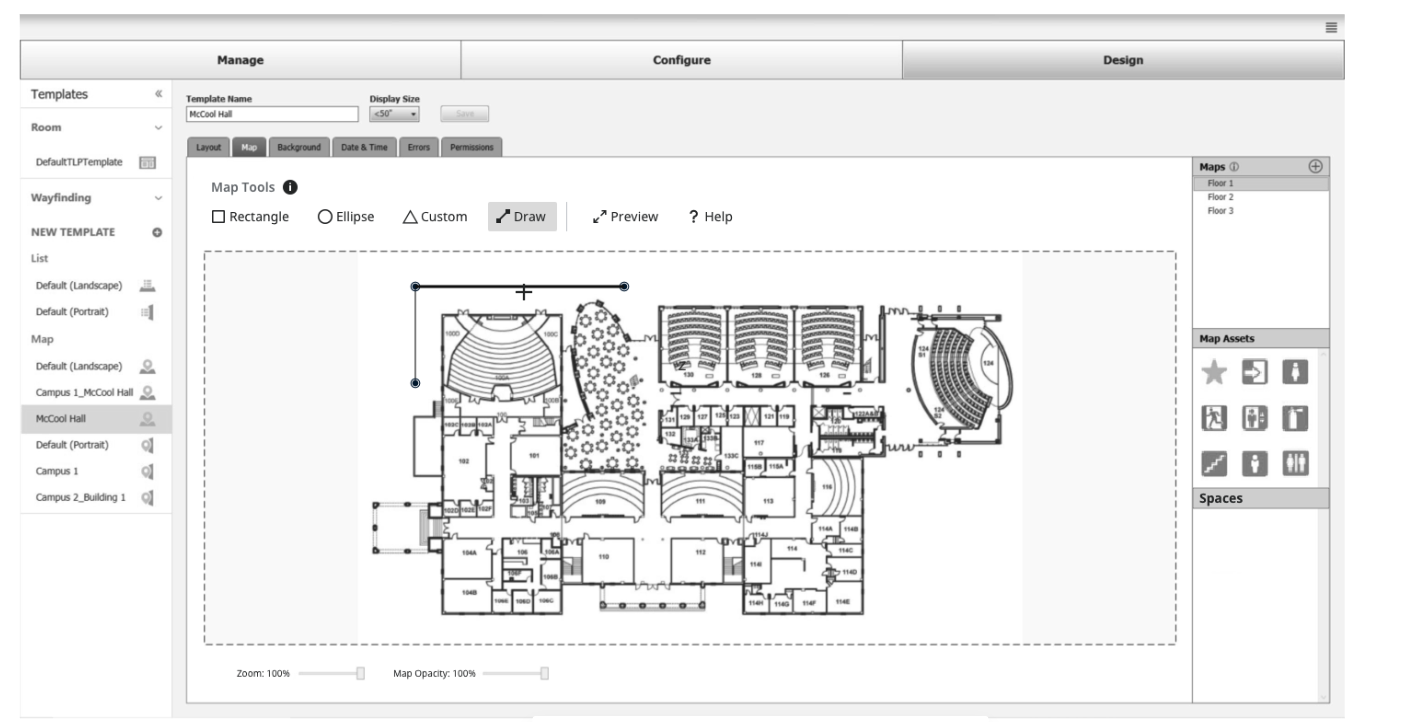
Step 1: Creating Boundaries
Start with an empty floor plan
“Draw” the outer perimeter
Save boundaries with unique identifiers

Add rooms to fill out inner perimeter
Step 2: Creating Routes

Add a start and an end point
The SW automatically connects the points via shortest path
Save routes with unique identifiers for CRUD
Repeat as necessary
In this model, users have the flexibility to plot individual points or to combine then and create routes
Start with an empty floor plan

Add points individually where users will turn

Specify which points should connect
Step 2: Create Routes (Route Mode)
Specify starting point

Specify end point
Repeat!
🤝 Compromise
Though UX’s recommendation was well-received by internal stakeholders and understood as a viable solution at scale, Eng was concerned that there were too many unknowns
We agreed to move forward with Engineering’s model, building onto it to achieve UX’s original goals
Prototype & Test
Goals
Document Users' initial reactions to the UI and individual controls
Understand Users' mental model for adding spaces, points and paths
Observe the discoverability of the help documentation
Uncover any usability issues with the wayfinding functionality
Understand how Users expect to manage spaces, points and paths moving forward
Document Users' understanding of the Lobby Display
Methods
Conduct a short interview about each User's experience with room management and/or wayfinding software
Perform a short, qualitative usability test
Utilize think out loud protocol to uncover insights and feedback
Simulate functionality via a combination of design software (Axure) and an interactive prototype
Review Lobby Display designs

Iteration
We learned quite a bit from our first round of usability testing and got right back to work. Here are some of the revised workflows:
Adding a space

Drawing Routes


Adding Points to Routes
Editing Routes
Visual Design
As this project has been in design, we have simultaneously been updating the Room Agent UI to follow our Design System as closely as possible
Our Design System is comprised of 60+ Angular components
Room Agent is built on .NET and utilizes Windows controls

What’s Next?
📊 More Usability Testing
🔄 More Iteration
Future Problems to Solve
Expanding the map view to support a campus environment
Explore filtering for spaces based on equipment and other criteria
Explore a web view (e.g. students want to be able to view the library Lobby Display from other places on campus so they can reserve a space BEFORE they walk across campus)